Analytics

Lies, damned lies, and huge Excel reports.

I was in a meeting the other day trying to figure out a particularly thorny issue. We had a group of smart, experienced, opinionated people in the room -- my kind of meeting.

About halfway through the meeting, one of the participants produced a huge, multi-page Excel print-out. Many of the pages had colored graphs, three or four to a page. A second set of pages contained an assortment of tables correlating variables against one another. An accompanying narrative outlined that there was a "significant" relationship between some of the variables because the correlation coefficient was over .5.

​"As you can clearly see from this graph..."

We all kind of sifted through the print-outs and gave them the old college try while the presenter tried to narrate. ​After a few minutes, it was clear that none of us, including the presenter, understood what the graphs meant. There was no description of the units or explanation of how they were derived. And so what happened was everyone started to use the graphs to explain their own point of view: "What I think they mean is..."

​It was humorous, really, and luckily we all noticed it and started laughing and threw the spreadsheets aside. At the same time, the experience was a good reminder of how easy it is to manipulate -- and be manipulated by -- numbers. 

A few tactical takeaways:​

  • Label graphs clearly for your audience, not for yourself. Provide notes if the graphs aren't clear -- but if the graphs aren't clear, rethink whether to use them at all.​
  • Be careful of comparing correlations of a huge number of interconnected variables. In many systems (datasets), the variables are correlated with each other -- that might be why you are studying them in the first place. So comparing a correlation of .5 to a correlation of .6 and calling the latter "better" is more than a tad sloppy and isn't the whole story by a long shot. Variables interact. To study the interaction of a number of variables, look to regression analysis instead.
  • "Significance" means something very specific in statistics. It is not the same as "strongly correlated."​ When two things are correlated, it means they vary in relation to one another. That's it. A correlation does not answer any questions about the causes of the relationship. When a relationship is "significant," it means that there is a very low probability that the relationship has occurred by chance. Two variables could have a low correlation with high significance, or a high correlation with low significance. Think of it this way: You might have a great night on the town with someone you hardly know; in the same way you might have a really lousy day with your closest friend. How well the date went is not the same as how close your relationship is. (IMPORTANT NOTE: Significance will increase with the population size, so with large datasets you can find that all the relationships are significant mathematically even if they have no practical significance at all!)
  • And most of all, this hopefully (?) goes without saying, but don't base decisions on a report that no one can understand!

Two reviews of The Signal and the Noise.

Over the last month I've been asked repeatedly about Nate Silver's The Signal and the Noise – have I read it? What did I think? What did I think while I was reading it? I'm guessing that anyone who spends even a small amount of time working with and talking about data has been similarly swamped with questions.

The coolest new thing. 

The coolest new thing. 

I've not read the book yet – it's on the holiday list – but I did find two reviews of the book on Andrew Gelman's excellent Statistical Modeling, Causal Inference, and Social Science blog. The reviews are by statisticians, and offer differing opinions besides, and so the entire post makes for good reading for anyone interested in what seems to be one of the trendier cultural phenomena of 2012.

Cool - and sobering - visual on homicide data.

The always fantastic, highly recommended Data Blog at the Guardian just published this engrossing Tableau-based interactive visualization on worldwide homicide rates. Not the cheeriest of weekend topics, but worth a quick look. (I tried to embed the code here but Squarespace wasn't having it, and trouble-shooting javascript doesn't seem like a good Saturday morning activity!)

For example, there has been a lot of talk in Chicago this year about the alarming increase in homicides -- but Chicago doesn't even make this list! New York is the only U.S. city in the top 60 or so in the visualization. Makes one count one's blessings...

In any case, I thought it was worth sharing. One of the many things I like about Tableau is that shared visualizations like this come with the data embedded -- in other words, you can download the data yourself to inspect it. 

Click to interact.

Click to interact.

May 9th Webinar: Deeper Segmentation Techniques for Fundraising!

If you looked at the exclamation point in the subject heading and said, “Huh? That doesn’t look exciting at all,” you can just stop reading now.

But for those of you who get excited by the idea of fundraising segmentation (I know you’re out there!), I wanted to let you know I’m hosting a free webinar next week to explore practical fundraising segmentation techniques. I’m going to try some new visualization techniques that may or may not work, so that in and of itself will provide some excitement above and beyond the subject matter!

This webinar is a follow-up to my presentation at the Nonprofit Technology Conference last month, but will be a complement to it — attendance at that presentation is not a prerequisite. So for those of you who did not attend, I promise you’ll still get something out of the presentation.

It takes on May 9 at 1:00 Central, and you can register here. Hope to see you there!

Getting Started with Analytics: Some Reading

Since returning home from last week’s 2011 NTEN Nonprofit Technology Conference, I’ve been asked about a half-dozen times for reading suggestions for fundraisers looking to learn more about statistics, and in particular, segmentation. 

I have a couple of suggestions to get you started, but I want to say that the best way to start to learn segmentation is to export some data from your database — say, the results of your most recent initiative — open it in Excel, and just look at what you see. Sort the list by donation size. How many large gifts are there? How many small gifts? Do you notice clumping around certain numbers? Look at the addresses of the donors — are more from certain places than others? These are basic questions, but they are the first step towards viewing your donors as individuals rather than as one anonymous whole. I’ll write more on that in coming weeks, but the message is: Don’t be afraid to play with your data! You won’t break anything, I promise.

Now, as for the recommendations, I always start with two books. The first is the reassuringly titled Statistics Without Tears by Derek Rowntree. You’ll like this book immediately just by its size — unlike most statistics texts, you can carry it with one hand. It looks at you non-threateningly, as a small puppy might. It is a classic book, first published years ago, and there’s something comforting about the type and the graphs. It reminds me of cookies and tea at Grandma’s. More than the appearance, though, is the content. You may sweat a bit in places, but there will be no crying, and you’ll come out the other side knowing a bit more about the things you know you should know (what is a median, and why does it matter; what does the standard deviation measure, and why shouldn’t you be afraid of the word “deviation”) but don’t. 

The second is the much more recent but excellent Fundraising Analytics: Using Data to Guide Strategy by Joshua Birkholz. Unlike Rowntree’s book, this book was written after the secret consortium of business publishers decreed that all business books much contain a colon in their title. (Have you noticed this? The same rule applies to movie sequels.) But more importantly, this is a very recent and much-needed addition to the vast number of fundraising books on the market, most of which lack any real specificity when it comes to collecting data and understanding it, and a few of which are patently banal. Birkholz walks through a number of basic and more advanced analytics issues, including a treatment of RFM analysis and an introduction to regression. It won’t make you a statistics hero, but it will go a long ways towards improving your knowledge, particularly if you read it with an eye not only towards specific techniques, but towards how he approaches data and analysis more generally. High recommended.

Neither book is a cheap ticket, but both are worth it, and should get you started. Happy reading!

Mind the Gap

I consider myself a fairly good parent. I love my kids, and I tell them; I make sure they eat well (McDonald’s right? just kidding); we all get lots of exercise, and we all get lots of sleep (well, I don’t, but they do). I know their birthdays, and I know their friends.

But I’d have a hard time telling you how tall they are. It’s just not something I have in my memory.

Amusement park operators clearly know this, and so at the entrance of every ride they have signs like the one at the left. They don’t expect me to know how tall my kids are, and they don’t expect me to be able to compare that height against an abstract. I just plop them next to the stick.

Think of how else an amusement park could have done this — when I enter the park they could have, for example, given me a print-out of each ride with the height and weight requirements. But what would I do with it? It would be the same data, but pretty much useless. 

This is an example of the difference between identical data that is usable (hey, my kid is too short) versus useless (what did I do with that sheet of paper?) simply because of differences in presentation. It matters how you present data, at least if you’re trying to get action out of it. And if you’re not, why present it? 
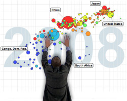
This is all a long introduction to one of my favorite tools, and favorite sites, and just favorite people: Gapminder from Hans Rosling. This incredible, ingenious tool allows you to map demographic data — say, the number of people who live in a country — against other demographic data — say, the number of people who live in poverty — and chart it out over time. This sounds very wonky to read but when you go to the site it is all very easy to understand and very intuitive. You select a couple of fields and hit play, and all of a sudden you can see pretty amazing relationships between them. Like, for instance, what is presented to you in the default graph, which is that a country’s life expectancy directly correlates to its income per person, and that the poorest countries, mainly in Africa, are fighting an uphill battle. 

So two themes here, I guess: One, if you are presenting data, think about the recipient’s frame of mind and present it in a way that will create an impact; and two, if you are looking to learn more about the world, the challenges we face, and why your part matters, take a look at Gapminder. 


Analyze this: The whitepaper!

Tomorrow at the 2010 Run Walk Ride Fundraising Conference in Dallas I’ll be delivering the keynote presentation about moving beyond traditional event fundraising metrics and towards a broader set of measures to create deeper insights about event fundraising programs. As part of the conference work, Event 360 has just released a new whitepaper, in partnership with Convio, on the same subject. This is obviously a deep topic — too deep to cover in any one short document — but I’m pleased with the depth we were able to offer. You can download an advance copy of the paper from the Resources section of Event 360’s website.

The 18-page guide is designed to help event fundraisers move beyond only reporting the past and start using analytics to predict the future. A case study featuring the Komen Global Race for the Cure highlights how we used analytics to help transform their highly attended event into a strong fundraising event.

Get the guide for free here. Thanks for reading!

Analyze this!

Event 360 has launched a new webinar series, which gave me the fun opportunity this past week to talk for 90 minutes or so to well over 100 nonprofits about our first topic: the basics of event analytics. This is a subject near and dear to my heart, both because I’m a bit of a data geek and because so many of the groups I work with are great at tracking data but pretty poor at doing anything with it. 

The fact is, with an hour of time, a flat file of your fundraising data, and Microsoft Excel, you can get a far deeper understanding of what is actually powering (or holding back) your program. 

The webcast was recorded and archived; you can view it for free here

Don’t be afraid of your data!